

Imagine you want your website to look awesome on every gadget, but there are just too many of them! It’s like a never-ending puzzle we can’t solve by making a special site for each one.
So, here’s the cool part – it’s called responsive web design! It’s like magic that makes your website fit perfectly on any device. No more stressing about different screens or losing visitors. With responsive design, your site becomes a superhero, adapting to every gadget out there. Ready to make your website a superhero too?
Let’s dive into the world of responsive web design together! But hey, before that, let’s figure out what is web design
“Fear looks, but faith jumps
Eric CEO of Vathos Technologies
Web Design

Designing websites is about making them look and feel good. It’s not just about creating software; it’s about giving users a great experience. In the past, the focus was on designing for big computer screens.
However, since the mid-2010s, there’s a growing need for responsive web design, ensuring that websites adapt and look awesome on various devices, from desktops to mobiles and tablets.
What is Responsive Web Design
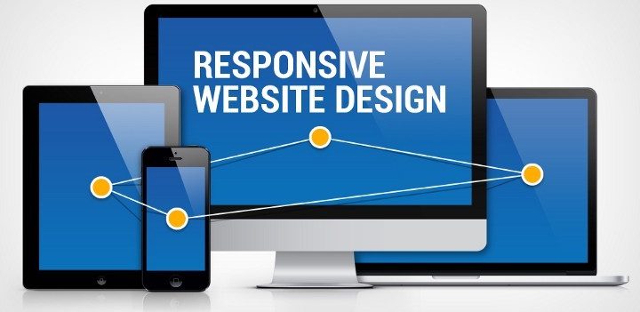
RWD, known as responsive web design for short, is a technique for web design that ensures a website looks good and works well on all sorts of devices, no matter if it’s a small phone or a big computer screen.
The aim of responsive web design
(RWD) is to ensure everyone is happy using the website, no matter what device they have. That way, no information in your content is left out while opening your webpage on different devices (laptop,desktop, tablet or mobile phone).
This can be achieved using HTML and CSS to either hide, shrink, enlarge, resize or move the content to make it look good on any screen. But hey,that’s not all about it.
Why Responsive web design?
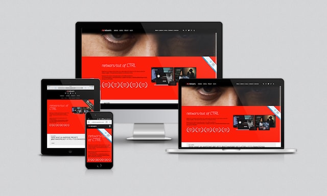
Responsive web design is like a magic wand for everyone involved – users, designers, developers, and businesses. Instead of pulling a rabbit out of a hat for each device, developers and designers can create one site that seamlessly fits various screens.
This means saying goodbye to the hassle of crafting a separate mobile version – it’s like having one website that’s a chameleon, adapting effortlessly for both mobile and desktop users.
Embracing responsive web design is like unlocking a treasure trove of benefits:
Enhanced User Experience:
Users get a seamless and consistent experience across devices, making navigation a breeze.
You can know the difference between user experience(UX) and user interface UI here
Cost-Effective Development:
Building one adaptive website saves resources compared to creating multiple versions for different devices.
Easier Maintenance:
Updates and changes only need to be implemented once, streamlining the maintenance process.
Improved SEO:
Responsive web design helps to boost your site’s SEO because search engines love responsive design and favors them by contributing to better rankings, visibility,load-times and overall user friendliness.
Future-Proofing:
As new devices emerge, your website is ready to tackle them without a major overhaul.
It’s not just about making things look good; responsive design is a game-changer on multiple fronts!
Key Elements of Responsive web design your website should have
To keep a flexible layout for your website, here are three elements of responsive web design you need to have for your website.
In order for your website’s layout to remain flexible, here are 3 key element of a responsive website your website must possess;
- Fluid Grids
To keep your website looking cool on different gadgets, you need to use something called fluid grids.
They make sure your content can easily adjust and stack up neatly on screens of all sizes, so everything flows smoothly and looks awesome!
- Flexible Visuals
Pictures and stuff are a big deal on websites, right? You want them to look cool on any device people use. So you want to make them flexible – that means they automatically change size to fit any screen.
Think about it_desktops are wide, and phones are tall, so your pics should be chill and adapt to make it awesome for everyone checking out your site!
- Mobile Navigation
Since many people spend a significant amount of time on their phones, it’s crucial for businesses to embrace a more mobile-friendly approach. The way users interact with websites on their mobile devices is different from desktop computers. To enhance ye experience,
incorporating larger buttons for easier tapping will do a great job.
A common approach for more mobile navigation involves using a three-lime icon,often called a “stacked pancakes” menu. This design is popular because it adjusts well to the vertical screen orientation of mobile devices, making it more user-friendly.
Examples of Softwares for Responsive web design
Seeing that in today’s business world, having a website that works seamlessly on both computers and tablets is crucial. When a site adjusts well to different devices, it makes the content easy to read and navigation a breeze.
To create these flexible web layouts, we’re lucky to have super amazing tools from our helpful developer community. These tools make the job less boring and bring your ideas to life!
Here’s just a handful;
- Bootstrap

Twitter’s creators designed bootstrap
to make prototyping easier. It comes with a cool ‘customize’ feature, allowing you to pick different responsive components for your page. You can download it with prepped CSS, jQuery, and more.
- Gridset
Gridset is a handy tool for developers and designers, making it super easy to build custom responsive layouts using grids. Whether you need a basic grid or something more advanced like CSS frameworks, Gridset has got you covered.
Plus, it plays well with popular CMS platforms like WordPress, Drupal, and Joomla. And hey, it even works seamlessly with graphics software like Fireworks and Photoshop! Cool, right?
- Adobe Edge Reflow

Adobe Edge Reflow stands out from Photoshop as it primarily focuses on graphic editing. It’s poised to become a favorite among designers because of its knack for handling responsive layouts effortlessly. With Reflow, you can effortlessly craft grid systems, handle media queries, and generate top-notch CSS layouts.
How To Get Started with Responsive Web design
After you’ve nailed the important stuff for making websites look good on any device, the next move is to figure out how to actually do it. Now you have a guide.
This roadmap for responsive web design includes exploring key elements like fluid grids and flexible visuals, utilizing tools such as Bootstrap and Adobe Edge Reflow, embracing a learning journey with video tutorials and free resources, engaging in hands-on practice, and joining the responsive design community to stay updated and inspired.
Now, you’re equipped to embark on your responsive web design adventure. Wishing you a happy ride on your responsive web design journey!



2 Comments
Your comment is awaiting moderation.
The way this post is organized makes the discussion much easier to follow and engage with, since the ideas are explained in a clear way and the overall tone encourages positive interaction and thoughtful participation from readers.
meilleur casino en ligne retrait immediat
Your comment is awaiting moderation.
https://shorturl.fm/Lg8Xx
Your comment is awaiting moderation.
https://shorturl.fm/25LLI
This Content is as clear as day on the subject matter.
Provoking.
Insightful.
Well written.
And compelling for interested Web Enthusiasts to dive deeper into enhancing their knowledge on the subject.
It’s a great read.
I enjoyed it.
Promise Nwadike
Founder, Glorified Digital Agency (GDA)
Thank you Mr Promise